
How to Choose the Right Colours for Your Web Design?
What if I tell you that purchasing decisions of 85% shoppers are based on colour? In fact, 52% of people suggest that they would not return to a website if it’s not aesthetically pleasing. Yes, this is true! The way you choose and use different colours in your web design can influence purchasing decisions, bounce rates, user experiences and even Search Engine Optimisation results. But, why is it so? The answer is quite straightforward: humans are visually-driven beings.
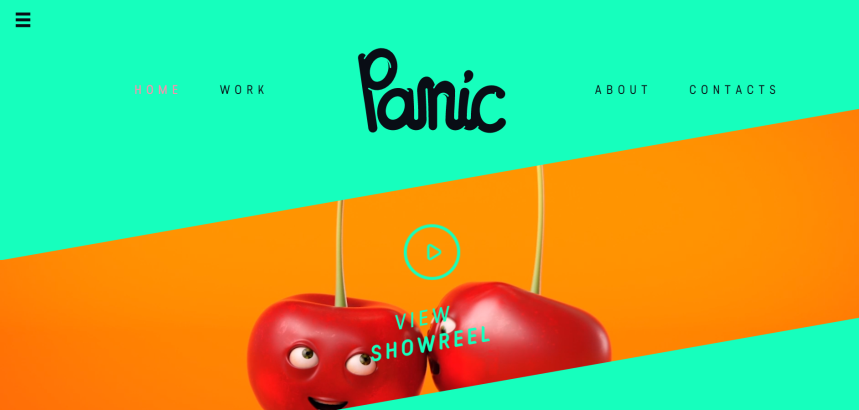
Just look at the homepage of Panic – a design and animation studio. Can you notice how awe-inspiring their colour scheme is? They tend to have a distinct colour palette in their web design, which nicely associates with their brand. Impressive; isn’t it?
What Effects Different Colours Generate?
Colours trigger certain emotions and there is a psychology behind each one of them. For instance, blue can make you feel calm, whereas, red evokes danger. The impact of a certain colour depends hugely on its brightness, shade and tone. Let’s have a look at some of the major colours and their effects:
● Warm Colours
Red, orange and yellow are warm colours and mostly evoke happiness, optimism and energy. You can use them to create an attention-grabbing effect for your calls-to-action (CTAs).
● Cool Colours
Cool colours are generally green, blue and purple. They are calming and soothing and often express sadness. You can use purple to spark creativity, as it is a mixture of blue and red.
● Happy Colours
Happy colours are bright and warm. They include yellow, orange, pink and red. When used correctly, these colours can create an uplifting effect on your mood. The brighter the colour, the more optimistic it will be.
● Sad Colours
Sad colours are dark and muted, such as grey, blue, green and brown. These colours are quintessentially categorised as sad, and often include black and white.
● Energising Colours
Strong, bright and neon colours can generate powerful emotions. The right use of bright red or neon green can make you feel energised. However, the wrong use of these colours can be irritating to the eyes.
Why your Website Colours are Important?
There are some businesses that might think of colours as another background element for their websites, but the reality is different. To give you some insights, let’s talk about a few good reasons why your choice of colours matters:
✔ They Create a First Impression
While designing or redesigning a website, most people focus on the first impression it will generate on a visitor. That’s where colours come into action and help websites create an ever-lasting impression on a visitor’s mind.
✔ They Increase Readability
The colours you choose play a significant role when it comes to your website’s readability. Apart from creating emotional connections, they make things easier on the eyes. Depending on your content and web design, your choice of colours will play a significant role in the dynamic of your conversation.
✔ They Make Essential Elements Stand Out
A well-thought-out colour contrast makes certain elements stand out. When you use a matching colour palette, your website visitors won’t get distracted from the content. For instance, using bold coloured CTAs usually attracts attention.
✔ They Represent your Brand Visually
Your choice of colour scheme is your visual identity and resonates in the minds of your prospective customers. That’s the reason why some colours have become associated with particular brands, such as the red color with Coca-Cola.

How to Choose the Right Colours for Your Website?
Trusting your intuition and taste isn’t always the right approach when it comes to picking the best colour palette for your website. Fortunately, you can follow the followings steps to achieve the best website design. Ready to make your website stand out in a pool of drab designs? Let’s get to work!
👍 Select Your Primary Colour
To start mixing your colours, the first thing you need to do is selecting the primary colour for your brand. This particular colour should represent your logo, story, message and other brand materials. One of the best ways to decide on your primary colour is to think about your products or services. Peruse a primary colour that nicely represents what your brand offers. For example:
- McDonald’s: Yellow implies optimism and happiness.
- Animal Planet: Green represents freshness and nature
- Walmart: Blue suggests dependability and reassurance.
- Adidas: Black implies luxury and elegance.
- Apple: White stands for sleek and user-friendly products.
👍 Include Some Additional Colours (If Required)
Done selecting your primary colour? Now, choose the additional colours that will complement your web design. Here, a good starting point is to pick those colours that are a counterpart of your primary colour. For instance, a red circle on a black background pops a little more than a yellow or blue circle. It’s always a good idea to use additional colours to highlight important features for your readers. While designing your website, try not to use too many colours on top of your primary colour.
👍 Choose Your Background Colour
This one is important: the background of your website supposedly covers more space than any other colour. Here, you can choose a muted version of your primary colour to empower your branding. For instance, use a white or grey overlay on the background. This is also a great idea for text to show up. Alternatively, you can think about an off-white colour for the whole background, which is a common choice for many websites, such as Weebly.

👍 Contrast the Colours
The next step is contrasting the colours you have chosen so far. Contrast and saturation are impactful, especially, when you want to draw attention to certain parts of the page. While they are useful, they must be used sensibly.
Using high contrast all throughout the website will minimise the readability and aesthetic appeal of that particular page. I, personally, would like to recommend you use a mid-level contrast for most of your website and high contrast for highlighting key elements, such as CTAs. Here’s an example: WordStream uses an orange CTA on the off-white background, which is an excellent use of contrast.

👍 Develop Shades and Tints
Once you have your colours in place, it’s time to work on the colour scheme. Some websites choose only a single colour for their website, while others use different shades or tints to make things appealing. Though the choice is yours, it is not always great to use a primary colour throughout the entire web design. Instead, try to tone it down or brighten the tint to create subtle changes on your website. For example, you can choose lighter shades of your primary colour to represent particular sections of the website and darker shades for the “contact us” button.
👍 Follow the 60-30-10 Rule for Mixing
This rule is simple but powerful when it comes to mixing different colours. If you want to create harmony, choose three different colours and combine them in the proportion of 60% (primary colour), 30% (secondary colour) and 10% (tertiary colour). It is not always necessary to go with three colours, but it is a great number to be balanced. Also, this proportion is pleasant to our eyes because it helps visual elements to emerge gradually.
👍 Choose a Typeface Colour
The final step of your colourful web design journey is nailing down a typeface colour. You might think black is the right option, but you’ll actually find out that using purely black typefaces is not the best choice. In fact, it isn’t as common as you would think. A purely black typeface on a purely white background can strain your eyes. This is because of a 100% contrast.
Read Also, Top Things Every Company Website Should Include
While using coloured typefaces should be reserved for specific elements, such as CTAs, you can use grey to give your website a softer look. Keep in mind that, there isn’t much room for experimentation when it comes to a typeface colour.
Dos and Don’ts to Ensure a Striking Colour Palette
Now that you know why your website colours matter and how to choose them, I want to bring your attention to some dos and don’ts. Just familiarise yourself with these things before you hire a web design agency.
- Do use white space to enhance the readability of dark text.
- Don’t make saturation inconsistent for your website users.
- Don’t just use your favourite colours. Be unbiased.
- Keep your colour scheme simple, complimentary and intuitive.
- Avoid using a dark background with light text since it may seem esoteric.
- Do consider gender if your brand caters to a specific gender.
- Don’t use too many colours on your website.
- Do use neutral colours or shades to balance your website images.
- Don’t be afraid to use different online resources or tools.
The Bottom Line: Colours Bring Web Designs to Life
There is no need to be a renowned web designer to come up with a stunning website colour scheme. It’s just a matter of understanding colour psychology. In the long run, this approach will allow you to make an emotional bond with your website visitors, which will contribute to a higher conversion rate and a lower bounce rate.
Hopefully, you’ve found this writing piece helpful. Thanks for reading!

Related Posts